Church Flyers Design: Do’s and Don’ts
In an era of digitization, we still fall back on traditional print media, producing church flyers, posters, news sheets, hymn sheets, handouts, the list is endless. The use of print is still very much relevant for informing church attendees, for outreach and also evangelism.
These helpful tips should serve as pointers to enable you deliver eye catchy church communication materials especially fliers:
- The Fonts must Complement Each Other
Do’s
Every publicity material includes texts and this is for a good reason. A picture is said to be worth more than a thousand words but if it cannot effectively communicate your message, then that flyer is lacking the purpose for which it is intended. Furthermore, having well written text is expected but more importantly is the choice of fonts for which these texts appear. The fonts should be warm and legible at first glance, sometimes fonts have a way of psychologically impressing and convincing one to attend an event. Ok, I made that up but it isn’t far from the truth. You get my message.
If you spend more time in considering the best font to use, it will make a huge difference in the then overall look and feel of the design.
Don’t
Do not use too many different fonts in order not to distort balance. It’s safe to say less is more
- Leave A Considerable Amount of Space
It is beneficial to leave a fair amount of white space. This can also be called negative space. This not only prevents the design from being overcrowded and cluttered, it also serves to draw attention to the details that are important.
Never include every detail you can think of because the more detail you think of, may end up serving as a distraction from the ideal message you want them to take away.
- Always Include Key Details
It is necessary to include clear directions for people to take after viewing your church flyer. The audience has to learn more or take out something and also perform an action as a result of viewing your publicity. Endeavour to use shapes, large types or contrasting colors to help call to action. For instance, You could use phrases like ‘For further information’, ‘book now’, ‘like us on Facebook’, ‘follow us on Twitter’ or simply including the date and time of the event. It just has to be a clear call to action; short and straight to the point. Never forget to add an address.
Don’t
For whatever fancy reason you may have, never include clip art.
Do’s
Always include photos that reflect your church life and culture. Even with the help of a camera phone, good pictures can be taken. It does not stop at taking good pictures, take the right pictures too. Plan with this in mind. You can also start by building up a photo library that best reflects the culture of your church so that the communication team will have something tangible to work with.
Don’t use obvious stock photography. Stock images could sometimes be very appealing but, restrict yourself from using it always falling back to it. Stock images will rarely portray an accurate and honest picture of your church culture.
- Always Get The Flyer Printed Properly
Remember that value is evident to those who pick up the flyer, restrict yourself from just making a photocopy of your flyer on a flimsy paper because, quality matters so much. Make use of an external good printer with a nice finish. It will make sure that the content will go right to the edge of the page and will not be cut off during the printing process.
- Never Use Loads Of Different Colors
We must have heard that less is more. We may think that overloading the design with so many colors will make it stand out and make the elements blend. But the truth is that it will end up toying with the eyes of your audience and further confusing your audience.
So in essence, use colors that work well together. They must complement each other. This can be achieved by taking a color palette as you begin to design and stick to it.
- Try using a new tool from time to time
Chances are that you may not have access to professional design software but be rest assured that there are a whole lot of you can get access to for free. For example Canva, It is like a little brother to Photoshop that runs in your web browser online and it is totally free.
It is my hope that these few tips have gone a long way in helping your church flyer design.
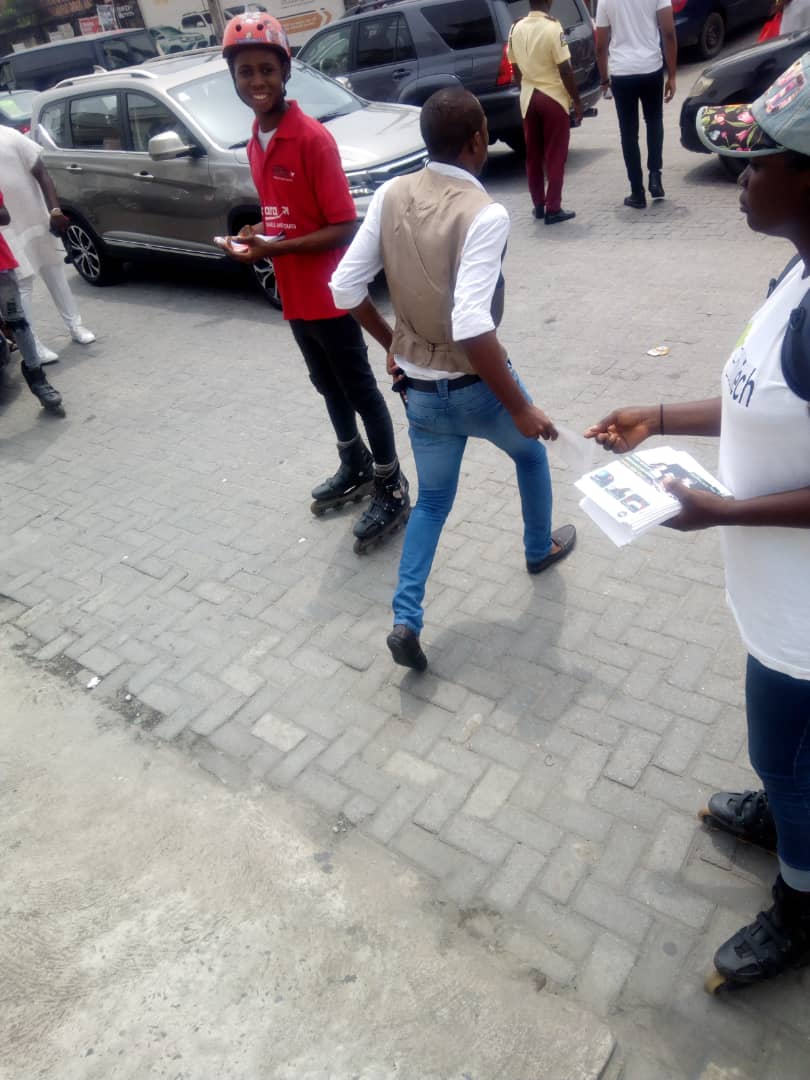
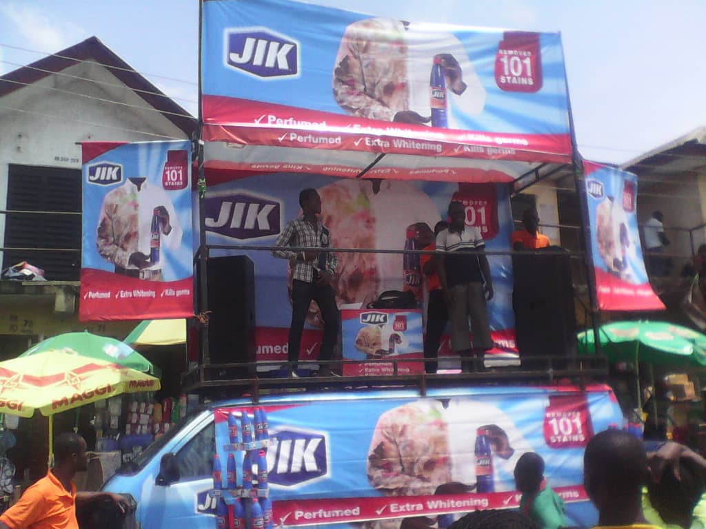
Use CityMarketing to grow your number of walk-in customers, online orders, inbound phone calls, email & social media enquiries – by faultlessly executing street marketing activation campaigns using smart promo girls on skates; leaflet distribution; newspaper inserts; eCommerce; Google search advertising; social media marketing; BRT bus/keke fleet advertising & roadshows in the busiest hangout spots, traffic routes, markets, malls, hotels, schools, mosques & churches all over Nigeria.
Call us today on +2341-448-9249 or 090-8499-9920.


